Another questionable article by Quing-Bin Lu (inventor of the bogus tropical ozone hole) has been published. His thesis this time is that global warming is caused by halocarbons (CFCs and their replacements) rather than CO2. I’m starting think he’s part of Big Oil’s disinformation program. If it’s not oil, they’re in the clear.
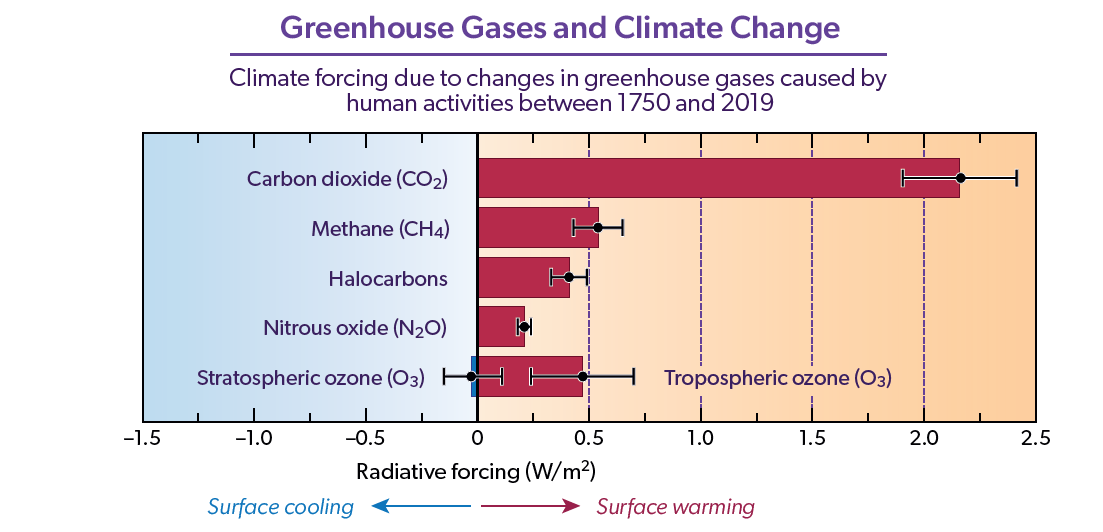
The current wisdom is that halocarbons (including CFCs) do contribute to the problem, but they’re a minor player compared with CO2. You can see their relative importance by the length of the bars below. Collectively, they are more important than nitrous oxide, and nearly as important as methane. But increases in CO2 have had at least 5 times their effect. And that disparity will increase over time as CO2 increases and halocarbons continue to decrease.
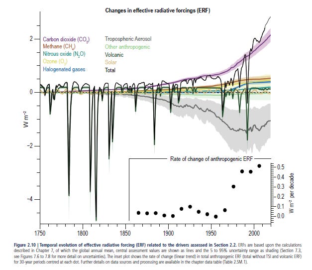
The figure below, from the most recent IPCC report, paints an interesting picture. The dominance of the purple line compared with the blue line confirms that halogenated gases are only a small player compared with CO2. But that grey line below the axis also tells us aerosols have played a huge part in recent years. Up to the 1970s, the increasing aerosols blocked sunlight enough to counteract much of the warming due to GHGs. But since then, as air quality has improved, the overall warming has accelerated. An unwelcome price of clean air!
Aside relevant to this readership. Another price for Kiwis in our pristine paradise is the greater penetration of UV radiation that clean air allows, which is a factor in our higher rates of skin cancer.
Accord to Lu, CO2 is minor player compared with the halocarbons. Some of the modelling details of the paper are beyond my expertise. Despite that, although the paper reads authoritatively, I’ve already spotted several errors in it. I won’t bother going it to those details here.
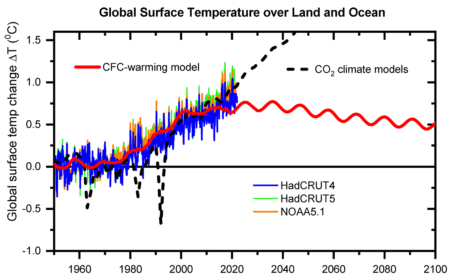
The bottom line of Lu’s paper - summarised in the plot below - is that we don’t have to worry any more. So his friends the oil barons can keep pillaging the Earth.
His model (the red line) predicts that because halocarbons are under the control of the Montreal Protocol, they will gradually decrease over time. I agree with him on that. And that temperatures will therefore decrease too. I disagree with that. We do still have a problem on our hands. And recent evidence tells us it’s getting worse, not better. The dashed gray line is much closer to the truth.
The other coloured curves in his plot show the observed temperature changes from 1950 to 2020, according to two British analyses from the Met Office’s Hadley Centre (blue and green curves) and an independent US analysis from NOAA (orange curve) of the data. The dashed grey curve is Lu’s representation of the standard climate models. He calls them “CO2 Climate Models”. But he’s done his best to make them look bad by including models which didn’t pass IPCC’s litmus test. Not all models are born equal. They vary hugely in their complexity and accuracy: their number of levels, maximum altitude, vertical and horizontal resolution, whether or not they include oceanic feedback, etc. If you dig down deep into the IPCC report (near page 2100 in Annex II of the 2021 WG1 report) you can see that in their final analyses the IPCC adjudged fewer than 50 of the more than 300 model studies as having the the necessary complexity, proven track record, and model runs available.
Using Lu’s model choices, the influence from three volcanic eruptions (Agung, El Chichon and Pinatubo in the 1960s, 1980s and 1990s) are hugely over-estimated compared with the IPCC’s choices. For example, according to the IPCC models the most recent of these eruptions (Pinatubo) led to a short-term temperature decrease less than 0.3 degrees, whereas the Lu’s plot implies an effect three times as large.
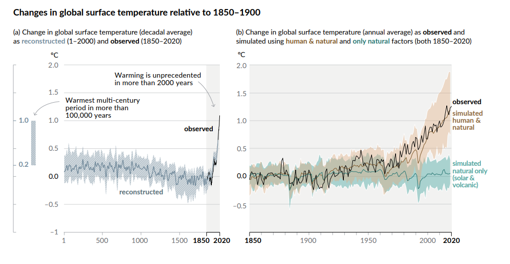
Despite Lu’s blanket acceptance of “CO2 Models”, good and bad, the long-term changes predicted by them agree remarkably well with observations over the entire period. Based in the most recent IPCC assessment, the agreement is even better, as shown below. See the excellent agreement in the right panel between observations (jagged line) and model (smooth line) over the last two decades. Note also the much smaller volcanic effects in those models. Admittedly they still appear to be larger than the observed effects. The models aren’t perfect.

Up to the turn of the century there wasn’t much between these standard models of climate change and Lu’s new model. Both agreed well with observations. After that, there is continued good agreement between observations in the standard models, but Lu’s results look more and more questionable. During the last two decades, observed and modelled temperatures have increased more rapidly. But Lu’s model says the opposite. By the end of 2020 (the last year in his analysis) observed temperatures were significantly higher than his model values. His model would look even worse if the period were extended to include this year’s recording-breaking highs.
I mentioned in an earlier post, there’s no need for a new theory if the old one reproduce observations. And that’s especially true if the new theory does a poorer job of predicting them.
If it ain’t broke, don’t fix it.


Fair enough Stan. The climate models certainly aren’t perfect. But better to move forward on the shoulders of giants than backwards on the shoulders of ... 🙂
I don’t agree with the view “If it ain’t broke don’t fix it” For example:
Milikan’s oil drop experiment measuring the charge on the electron back in 1906 ( from which he won the Nobel prize ( not sure if his compatriot also got it) was accepted as being correct and when the experiment was done by several others it was assumed that their results had errors because they didn’t match Millikan It was eventually shown that the original result was not quite correct