Energy imbalance now and over eons
Mankind's meddling in a longer context scares paints a scary picture ...
As climate guru James Hansen keeps reminding us, our problem with climate-change is an energy imbalance problem. With the build-up of greenhouse gases, more energy comes into Earth from the Sun than goes back out. That’s because most of the incoming energy is at shorter wavelengths (visible and near infra-red) that are largely unaffected by those greenhouse gases, whereas the outgoing energy is at longer infra-red wavelengths which are affected.
According to NASA, the current energy imbalance is around 1 Watt per square meter and has doubled since 2005. James Hansen’s work also shows that the rate of change of the imbalance is increasing as we idly twiddle our thumbs. Currently, it’s increasing each year by around 0.04 Watts per square meter of Earth’s surface.
A recent paper attempts to put the current energy imbalance into a longer term context. If correct, it scares the living daylights out of me, because those past imbalances - which were large enough to plunge the world in and out of ice ages - are tiny compared with the current man-made situation!
The authors make use of differences in the ratios of two isotopes of oxygen found in ice-cores and ocean-sediments to infer past changes in energy imbalance. The idea is based on the premise that any imbalances eventually show up as changes recorded in the oceans and the ice-caps, which are the two biggest storage reservoirs of energy.
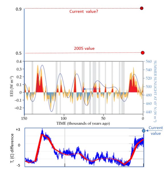
The main result from the paper is shown in the upper panel below, which shows the calculated Earth’s Energy-Imbalance (EEI) extending back 150,000 years. I’ve added those current figures on an extended vertical axis. They’re scarily big compared with the historical values. And look how fast they’ve changed in the last few years!

The ups and downs in historical energy imbalance are shown in orange. For the purposes of this argument, the other colours are unnecessary complications (they are just to add emphasis to periods of positive and negative imbalance). Similarly, the grey areas aren’t needed here (they’re so-called ‘Heinrich events’, associated with periods when huge icebergs broke off the Northern Ice Sheet into the ocean). The biggest past change in energy imbalance is around 0.3 Watts per square metre, much smaller than the current imbalance that’s shown on the extended left axis of the plot.
For comparison, I’ve added (in the lower panel) the temperature changes derived from Antarctic ice cores over the same period (truncated from here). The match isn’t perfect, but the temperature changes show the same broad features. I’ve also indicated the (very approximate) current temperature change near the top of the right axis.
What I’m interested in is the relationship between these past changes in reconstructed energy imbalance, compared with those expected from current theory. As you will see, the relationship is strong. The biggest deviations in energy imbalance largely follow the amount of sunlight Earth receives during the summer at 65°N, which is shown by the blue line referred to the right axis. These variations are due to long-term changes in the ellipticity of the Earth’s orbit about the Sun, the orientation of Earth’s spin axis, and the precession about that spin axis (i.e., the climate variations predicted by the Milankovitch theory). The most recent minimum, about 20,000 years ago signalled the end of the last ice age. For most of the period since, there has been a positive imbalance, leading to a warming. Based on the blue line in the top graph that should now be negative, leading to a cooling …..
But it isn’t. Instead of falling below zero, as has previously occurred whenever the summer sunlight at 65°N reduces below 480 Watts per square metre, this time it has stayed positive. That’s because of the buildup of greenhouse gases. The imbalance is currently increasing each year by 0.04 Watts per square metre and is already double that responsible for the transition between inter-glacial and glacial (ice age) periods. Consequently the man-made changes we’re subjecting ourselves to are causing much faster changes than ever before. Note that I’m not talking here about the changes visible on the plot. On the timescale of this graph, the last few hundred years is less than the thickness of that right axis line.
The concern is that the energy imbalance now remains positive, even during a period when the orbital changes are predicting a negative imbalance. It’s not surprising either. The imbalance from mankind’s meddling is already at least twice as large as those that led to ice ages and interglacials over the last 150,000 years. We’re now easily overpowering those orbital effects. It’s no wonder temperatures are now increasing so much faster than at any time in that long period.
On a positive note, the imbalance we’re currently causing will inevitably start to reduce soon, as our fossil reserves dwindle and the oil barons finally go broke. So, unlike those past imbalances - which lasted thousands of years - this man-made one may last only a hundred or so. Sadly though, that turnaround date will be too late to sustain ‘civilisation’ as we know it for future generations.
At least there are no more ice ages in sight!

Very scary a d