Global patterns in UV
... and linkage to skin cancer rates
Continuing the melanoma theme from my last posting. I was going to include some of this in a paper that I’m working on, but couldn’t resist putting it out here ….
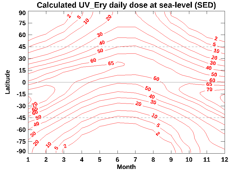
Damage to your skin from UV exposure depends more on the sunburning UV dose received than on just the UVI at midday that’s most commonly reported. The latitudinal and seasonal pattern in daily dose available is illustrated by the ‘contour map’ below. The labelled contours are given in SEDs, an abbreviation for a ‘Standard Erythemal Dose’ (which I sometimes write as UVEry).
The main drivers of this pattern are variations in sun elevation angle, the number of daylight hours, the amount of overhead ozone (which all vary with season and latitude), and seasonal variations in the Earth-Sun separation.

To put those numbers into perspective: for the most sensitive skin types, slight reddening of the skin will be seen following doses of 2.5 SED. You can see from the graph that at latitudes greater than 45 degrees, the daily doses in winter are well below that threshold. At the other end of the scale, the daily dose sometimes exceeds 75 SED, corresponding to more than a whopping 30 sunburning doses for fair-skinned people.
And these are just monthly means. On some days, UV doses could be higher by 10 percent or more. Fair-skinned people would need to apply a sunscreen with an SPF of more than 30 to avoid skin damage (and they’d need to reapply as directed to make sure that SPF rating remains valid throughout the day).
At latitudes closer than 45 degrees from the equator, more than half the daily dose is received within 2 hours either side of solar noon (the time of highest sun elevation), so sun exposure in that period should be avoided. But remember that ‘solar noon’ can differ markedly from midday shown on your clock. For example, in the New Zealand summer, the highest sun elevation occurs around 1:30 pm, so the danger period is between 11:30 and 3:30 pm.
These numbers are accurate for the conditions stated, but they need to be taken with a grain of salt because the calculations to produce them exclude a few important real-world effects. For a start, changes in altitude and surface reflectance (we call it surface albedo) are ignored. In clean air, sunburning UV increases by about 6 percent per km increase in altitude, and it can increase a further 20 percent or more due to reflections from snow-covered surfaces. So, at high altitudes over snow covered surfaces, the doses could exceed those shown by a 50 percent or more. For example, while the contour map shows that dose can exceed 20 and 30 SED at the North and South Pole respectively. In reality, at the snow-covered South Pole nearly 3 km above sea level, the daily dose over those 24 hours of continuous daylight in summer could exceed 50 SED/day.
On the other had, the calculations also exclude the masking effects of clouds and aerosols, so are more indicative of the UV risk on unpolluted sunny days. Mean values are typically about 30 percent less than these calculated clear sky values, but that blocking varies greatly with location and time.
Notice that the peak values don’t occur at the equator as you might have previously guessed. They are significantly greater at latitudes around 23S where the date of highest noon sun matches that when the Earth-Sun separation is at a minimum. For that reason, UV doses tend to be larger in the southern hemisphere than at corresponding northern latitudes. The contrast is exacerbated by the lower ozone amounts in the southern hemisphere.
How important is this asymmetry between the two hemispheres?
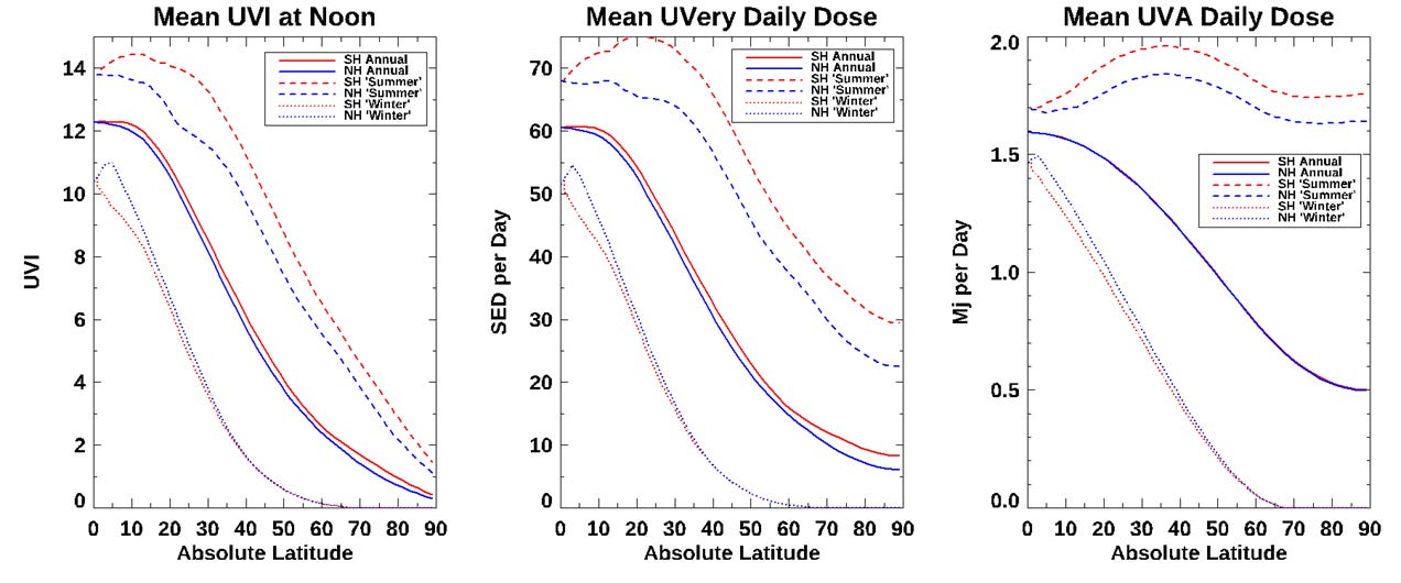
I’ll try to answer that using the plots below, where I compare the latitudinal gradients for three different UV quantities: (at left) the UVI at noon, (at centre) the mean dose of sunburning UV (UVEry, corresponding to the contour map above), and (at right) the mean dose of UVA. The latter is independent of ozone and is not implicated in sunburn (though it does cause skin wrinkling and may be implicated in skin cancer). Within each plot I compare southern hemisphere values (in red) with those in the northern hemisphere (in blue). The three pairs of curves in each plot correspond to the annual mean UV (solid curves), the month with highest UV, labelled ‘summer’ (dashed curves), and the month with the lowest UV, labelled ‘winter’ (dotted curves).
I could pore over these for hours, but I’ll leave that to other nerds.

The main take-home messages are:
All three plots show strong latitudinal gradients in annual means (solid curves), though the drop-off is slower in the southern hemisphere.
The gradients for sunburning (UVEry) dose are smaller than for the noon UVI, especially in summer because the longer days lengths (and gradients are steeper in winter because of the shorter days).
There’s more UV in the southern hemisphere than at corresponding northern latitudes.
In summer, latitudes at 20S to 25S have the highest daily doses of sunburning UV, and even at latitude 40S the summer dose is similar to that at the equator. By contrast, the summer dose poleward of 40N is lower than at corresponding southern latitudes by 20 percent or more.
Gradients are even smaller for UVA, especially in summer. The highest daily doses of UVA occur at latitudes between 30S and 40S, where they exceed those at corresponding northern latitudes by around 12 percent. The N-S contrast is smaller than for UVEry because UVA is unaffected by the lower ozone amounts in the south.
These hemispheric asymmetries may be important contributors to Australia and New Zealand having the world’s highest rates of melanoma skin cancer (especially given that real-world differences are likely to be larger due to the unpolluted skies in these southern hemisphere locations). However, the steep latitudinal gradients will also be a major contributor to those rates being twice that in the UK with its much higher range of latitudes, as I discussed here.
This next two paragraphs are pure speculation, but may be worthy of further thought.
I also wonder how important those huge seasonal differences in UV at higher latitudes are to melanoma rates, which seem to be related to the number of sunburn events, rather than the cumulative UV dose received. At higher latitudes where winter UV doses are small, the skin can become more sensitized over those winter months and thus more susceptible to sunburn when the high UV levels return in summer. Could those larger seasonal swings therefore be a contributor to New Zealand having similar melanoma rates to Australia where annual doses are much higher?
Even more speculatively …. Those high UVA levels in summer may be implicated in more than just skin-wrinkling. Unlike the induction of erythema in humans from UV in sunlight, the induction of skin cancer in mice has been shown to have a sub-peak in efficiency at UVA wavelengths - in addition to the major peak at UVB wavelengths. The existence of a UVA peak has been disputed in the case of melanoma in humans, but if it were present for other forms of skin skin cancer, could the consistently high summer UVA daily doses, combined with the large seasonal variation at higher latitudes, also be important?
Food for thought? More work needed 😊? Or pure poppycock? Feedback welcomed (preferably through the ‘Comments’ tab for this post in the Substack app). But please be nice. Remember that I’m just an atmospheric physicist.
More on UVA next time ..

Richard- This is so useful and informative. I particularly appreciate the graph you shared. Hope you're well this week. Cheers, -Thalia
Richard, NIWA provides measurements which show New Zealand’s seasonal variation of atmospheric Ozone, and that chart also shows what I think are the latest weekly or daily measurements. Please explain why weekly or daily Ozone measurements sometimes vary as much as the seasonal variation. This might be explained by variations of weekly or daily levels of chemical pollutants, dust, and solar radiation in the stratosphere. However, NIWA’s charts for 5 stations in NZ where UV is measured give daily predictions of UVI and these show almost unchanged predictions from one week to the next? This seems inconsistent with the other chart.