James Hansons’ latest Climate Update provided some great insights - and a warning - about the “Heat Dome” I discussed last week. I won’t repeat it all here, but thought I’d share a few of the figures he showed, as every picture’s worth at least 1000 words.
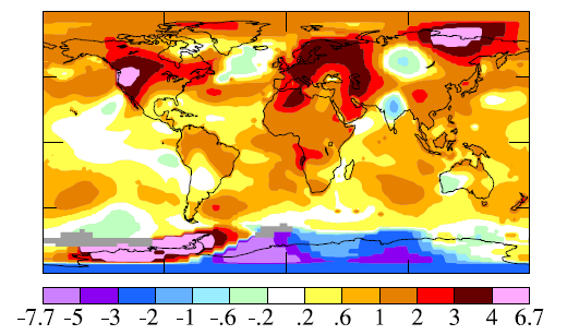
In the image above, the heat dome over North America - but also in Europe and East Asia - is all too obvious. The June temperature anomaly sometimes exceeded 6°C. Interesting that some high southern latitudes were cooler, but in New Zealand it was about 1°C warmer than usual.
In a changing climate, the term “usual” needs some caveats. The plots below show that the entire distribution of temperatures - and in particular the extremes - is rapidly moving upwards. In the first period shown below (1951 to 1980), summer temperatures exceeding the mean by more than 3°C hardly ever occurred (only 0.1 percent of the time). But in the last ten years, that’s increased to 22.1 percent of the time! Put another way: temperatures now exceed the pre-1980 mean by more than 3°C for about three weeks of each northern hemisphere summer.
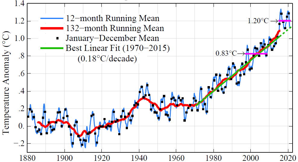
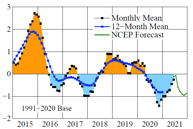
And that’s not all. The plots below show the long term increase in temperature, and how that inexorable increase can at times be suppressed by another climate pattern: the El-Nino. As a result, temperature increases aren’t monotonic, but tend to increase more rapidly during La Nina periods, and more slowly during El Nino periods.


For me, what’s most scary is that the recent heat anomalies - with their disastrous consequences - occurred during an El Nino period when such effects should be less severe. That doesn’t bode well for the future.
I’ve provided a only very quick summary here. If you need more details, please read the full text of Hanson’s article.
Thanks for getting this far! Previous posts on the intersection between Ozone, UV, Climate, and Health can be found at my UV & You area at Substack. Click below to subscribe for occasional free updates.


