James Hansen has a way of getting to the nub of the matter. This is mostly lifted from his pre-Christmas post, which gives a lot more detail than I provide here.
The previous Climate Assessment Report from the IPCC (AR5), released to the public in 2014, used four future scenarios: RCPs (Representative Concentration Pathways), RCP2.6, RCP4.5, RCP6 and RCP8.5. They were first defined in their Third Assessment Report (TAR) in 2000. The number in these RCPs is the projected “radiative forcing” by greenhouse gases by year 2100, which is proportional to warming. For example, RCP2.6 was defined as a pathway to keep global warming below 2°C. But emissions growth after year 2000 meant that by 2014 the 2°C limit could be met only if, in addition to those large projected reductions in emissions, there was a large uptake of carbon - i.e., ‘negative’ emissions.
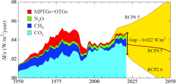
Hanson’s plot below - an extension of one I’ve discussed previously - compares the real world growth rates of greenhouse gases since 1950 with three of those future scenarios. The target is to reduce that growth rate to zero, or less, to avoid future warming. Unfortunately, the actual annual growth of climate forcing – shown by the upper edge of the red area – has increased in the past decade, and the trajectory we’re currently following is closer to the RCP6 pathway (which would lead to a disastrous temperature increase in excess of 4°C), rather than the RCP2.5 pathway required to limit that to 2°C.

There’s already a big gap between reality and RCP2.5. The negative emissions required in 2021 to match the RCP2.6 scenario would have to have reduced the annual growth of greenhouse gas climate forcing by 0.022 Watts per square metre of the planet’s surface area.
As Hansen explains, the gap between reality and the 2°C scenario can be converted to the atmospheric CO2 reduction required to close that gap during a single year. He calculates that in 2021 the required CO2 extraction (negative emissions) was 1.55 parts per million of atmospheric CO2, which corresponds to 5.58 gigatons of carbon. That’s a small fraction of the total amount of CO2 in the atmosphere, but still a large number. It’s equivalent to the weight of oil in about 20 million full loads of the world’s largest oil tanker. Quite a lot! (Tragically, about 40 percent of world’s shipping is devoted to the transport of fossil fuels!)
That carbon reduction corresponds to half the world’s current annual carbon emissions. Or a tenth if we give ourselves 5 years to do it. Or a twentieth over 10 years, etc. But the longer we leave it, the harder it gets.
That’s a definite “Not Achieved”. A failure mark. In fact it’s a negative test score. Incredibly, despite all the warnings, we’re still moving in the wrong direction.
It’s small comfort that at least the annual growth in total current forcing is less than it was in the 1980s. The main reason for the reduction since then is the phase-out of gases mandated by the Montreal Protocol on ozone depletion - shown by the narrowing of the red-shaded area.
On that subject, I recall a colleague recently arguing about the validity of “World Avoided” calculations of future reductions in ozone (and increases in UV) if there had never been a Montreal Protocol. Those calculations assume that atmospheric chlorine would have continued its pre-1990s rate of increase. My colleague argued that such a rate of increase couldn’t possibly continue because the world would see the problem and act to reduce those harmful emissions. In response I noted that our corresponding inaction on greenhouse gases despite blindingly obvious evidence of its harmful effects gives lie to his assumption.
Left to our own profit-driven motives, mankind is demonstrably capable of amazing stupidity, as the picture above reminds us.
Thanks for reading this. Previous posts on the intersection between Ozone, UV, Climate, and Health can be found at my UV & You area at Substack. Click below to subscribe for occasional free updates.


