One of my tennis mates told me about an article he’d read, which claimed that CO2 levels had been far higher in the past, and that the association CO2 and between temperature, as reported by the IPCC, is bogus. It also implied that this new information is being withheld from the public by the IPCC.
Sorry, he couldn’t provide a link to it - but it doesn’t deserve the air-time anyway. I’ve seen heaps of this sort of stuff before.
That last part of the claim is way off the mark. The IPCC documents are thousands of pages long, and contain everything you need to know about the subject. The only problem is finding it. Their focus is on new understandings, and how they affect future climate projections, rather repeating old stories. So, if you want to know more about palaeontology, you need to look at their earlier assessments. But that doesn’t mean the subject is completely ignored in the most recent assessment.
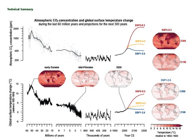
For example, long term changes in CO2 and temperature, back to the time of the dinosaurs 60 million years ago are nicely illustrated in the piecewise plot in the figure below from the most recent Assessment. Even higher levels were present on time scale of billions of years, especially during periods of intense volcanic activity. But they are irrelevant for life as we know it. The plot shows that first part of my tennis mate’s story is indeed correct, but only if you go back in time more than two million years, far earlier than the period when modern man (homo sapiens) evolved. The rest of his contentions just don’t add up.

The first (leftmost) part of the figure, covers the period 10 to 60 million years ago. It shows that 50 million years ago, CO2 levels were about four times greater, and temperatures were about 15 degrees warmer than the pre-industrial era.
The second part, for the period 1 to 10 million years ago, includes the era when now-extinct first versions of humans evolved. In the early part of that period, CO2 levels and temperatures were indeed higher than at present (but at the present rate of increase, they will be exceeded in the next few decades). By two million years ago, they had dropped to below current levels.
The third part of the plot, showing less than 1 million years, includes the period of evolution of modern man - homo sapiens - about 200,000 years ago. This period is interesting because it shows that with those CO2 levels, the Earth’s radiation budget was so delicately balanced that small variations in Earth’s orbital motions could trigger large changes that lead to alternating glacial and inter-glacial periods lasting thousands of years. Interestingly, the difference in temperature between glacial and inter-glacial periods is only ~4 degrees Celsius. Climate deniers sometimes point out that the temperature changes appear to precede the CO2 increases, and argue that that CO2 increases therefore can’t be the cause of the temperature increase. But it was shown in Ian Stewart’s ‘Hoard of Mathematical Treasures’ that they can. It depends on the relative response times between the forcing agent (i.e., the slow increase in CO2 flux - over decadal time scales - from the biosphere, which depends on many factors including ocean circulation) and the response (i.e., the rapid temperature increase due to changed radiative forcing). My understanding of what happens is this.
Gradual changes in the orbital motions of planet Earth lead to variations in ice cover which have large knock-on effects. For example, at the end of the last glacial period, about 25 thousand years ago, they caused the amount of ice cover to decrease substantially. The resulting reduction in surface reflectivity meant that the planet could absorb more radiation from the Sun, and thus immediately began to warm. But it’s complicated. That temperature increase would in turn cause more water to evaporate from the oceans and so increase the amount of cloud cover. Increased reflectivity from those clouds would counteract some of the reduced reflectivity from the ice. In any case, that ice-melt was just the trigger. As I showed in my post a couple of weeks ago, the amount of CO2 cycling naturally between ocean and atmosphere is huge. The main subsequent warming was caused by enhanced gradual release of more of that CO2 from the oceans as they warmed and as the ocean circulation patterns changed with the less extensive ice cover. The CO2 released then amplifies the initial warming caused by the orbital changes (a positive feedback). But known cut-off effects which have non-linear cut-off effects must also be taken into account. As Stewart remarked “Non-linear dynamics can be counter-intuitive, which is why we have to use mathematics rather than naive verbal arguments”. That mathematical answer is detailed nicely in pages 164 to 170 of his book. My mathemagician colleague Ben Liley kindly checked his maths for me, and we agree with his conclusions (though he did find a minor typographical error. One of the coeffiecients in the equations on page 168 should have been 0.16 rather than 0.10 😊).
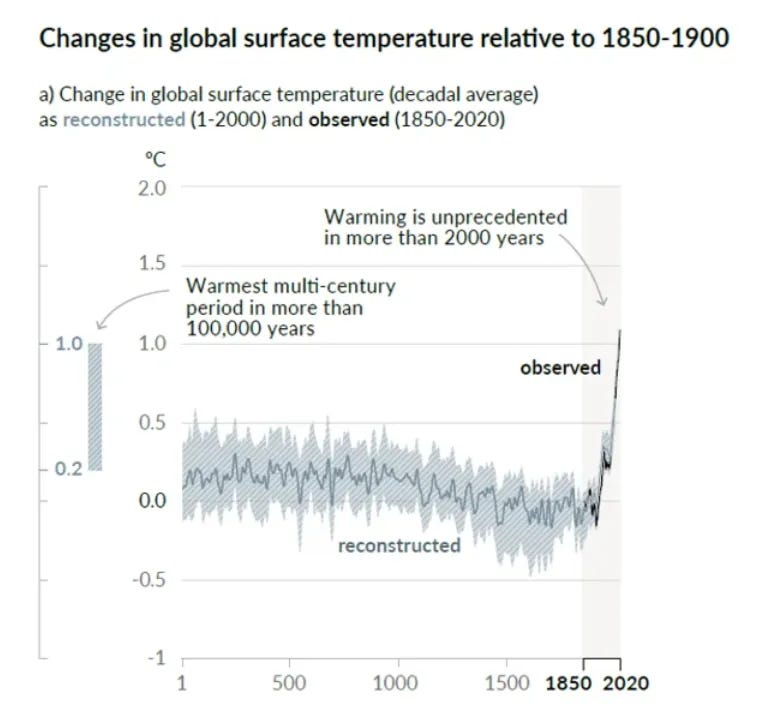
The final part of the plot shows the much shorter 350 year period from the start of the industrial revolution one and a half centuries ago out to about two centuries ahead of the present time, which is near the middle of the graph segment. The rate of change of CO2 and temperature far exceeds that in any preceding period (and is better represented on a linear time axis, such as in Mann’s famous hockey stick plot - which I showed a couple of weeks back, reproduced at the end for your convenience).
Despite our acute awareness of the problem since last century, that rate has continued to increase (thanks to those Merchants of Doubt). The red, yellow and blue curves in the first plot show projected changes for the decades ahead, based on three assumed future emissions scenarios. Sadly, the scenario that most closely matches the currently observed rate of change is between the red and yellow curves - and closer to the red. On our current trajectory, we’re headed towards a temperature increase far more than 5 degrees Celsius.
Throughout all four periods, you see the tight positive correlation between CO2 and temperature. If you move one vertically to overlay the other, the changes are just about indistinguishable. Note though, that although the changes look similar on the plot, the relationship isn’t linear. The temperature changes are plotted on a linear y-axis, whereas a logarithmic y-axis is used for the CO2 changes.
There are a couple of caveats worth mentioning.
First, with our emissions of CO2 from fossil fuels that had been locked up for thousands of years, mankind has already tipped the scales enough to ensure that there won’t be another ice age in the foreseeable future (it was already unlikely anyway because of the changing phase between the three main orbital cycles at play). In the long term, I guess that’s a good thing because it would be even harder to support 8 billion people on an ice-locked planet than one with sea-level up to our ears. But we still have the more immediate problem of how to feed and sustain a population of 8 billion for the next few centuries or millennia.
Second, there must be doubt about the long term rollover of that red curve. It rolls over around 2150 because there will be no more fossil fuels to burn. As I showed in an earlier post, fossil fuel reserves are not expected to last that long. At the current rate of use, they all be gone by the turn of the century (year 2100), which means that whatever happens, we need to transition away from them. Hopefully, they’ll become too expensive as a result much sooner so we’ll be forced to accelerate the move away from them. But I fear it’s already too late.
The inset maps in the figure show the calculated global distributions of temperature changes relative to the pre-industrial era for each period. The redder the map, the warmer it is. It’s a tragic embarrassment.
Which all goes to prove that a picture is worth about a thousand words! 😊
So I won’t attempt to further summarise the one below ..


