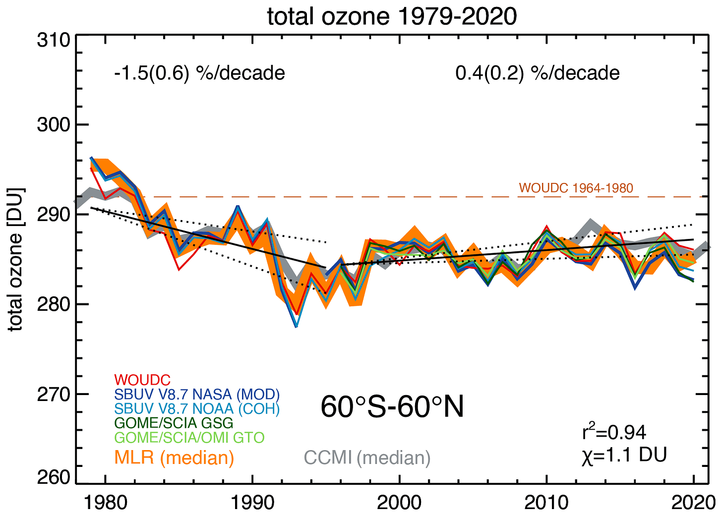
Good news! Ozone is now officially trending upwards over most of the globe. A paper led by Mark Weber at Bremen Germany just published confirms the good-news story that I’ve been bleating on about for the last couple of years …
It will no doubt be discussed at length in the forthcoming quadrennial Ozone Assessment. Actually, I’ve just discovered that the graph is an update of one that appeared in 2018, just in time for the previous Ozone Assessment. It showed essentially the same message, but the new version is still worth talking about
The paper combines near-global ozone data from all reliable satellite-based instruments and ground-based sources to show (see figure below) that since the mid-1990s, the upward trend is now statistically significant. It’s a slow process. The rate of increase is only one third of the rate of decrease through the 1980s.
But it’s not all beer and skittles. If you look closely at the graph - try covering the few data points between 1990 and 1996 - the picture looks quite different. You can see that if the start of that latter period had been delayed a couple of years, the conclusions about ozone recovery would be quite different. In the last two decades there’s been no significant change in ozone. And you could argue that they should have delayed the start a couple of years - as we did in our 2019 paper - to make sure any lingering volcanic effects, most notably from the 1991 eruptions of Mr Pinatubo weren’t still affecting ozone in the mid-1990s. It’s well known that the chemical reactions on the aerosol cloud from the eruption led to ozone depletion that persisted at least the first two years after the eruption. Its effects clearly contributed to some of that downward trend in ozone in the first part of the graph.
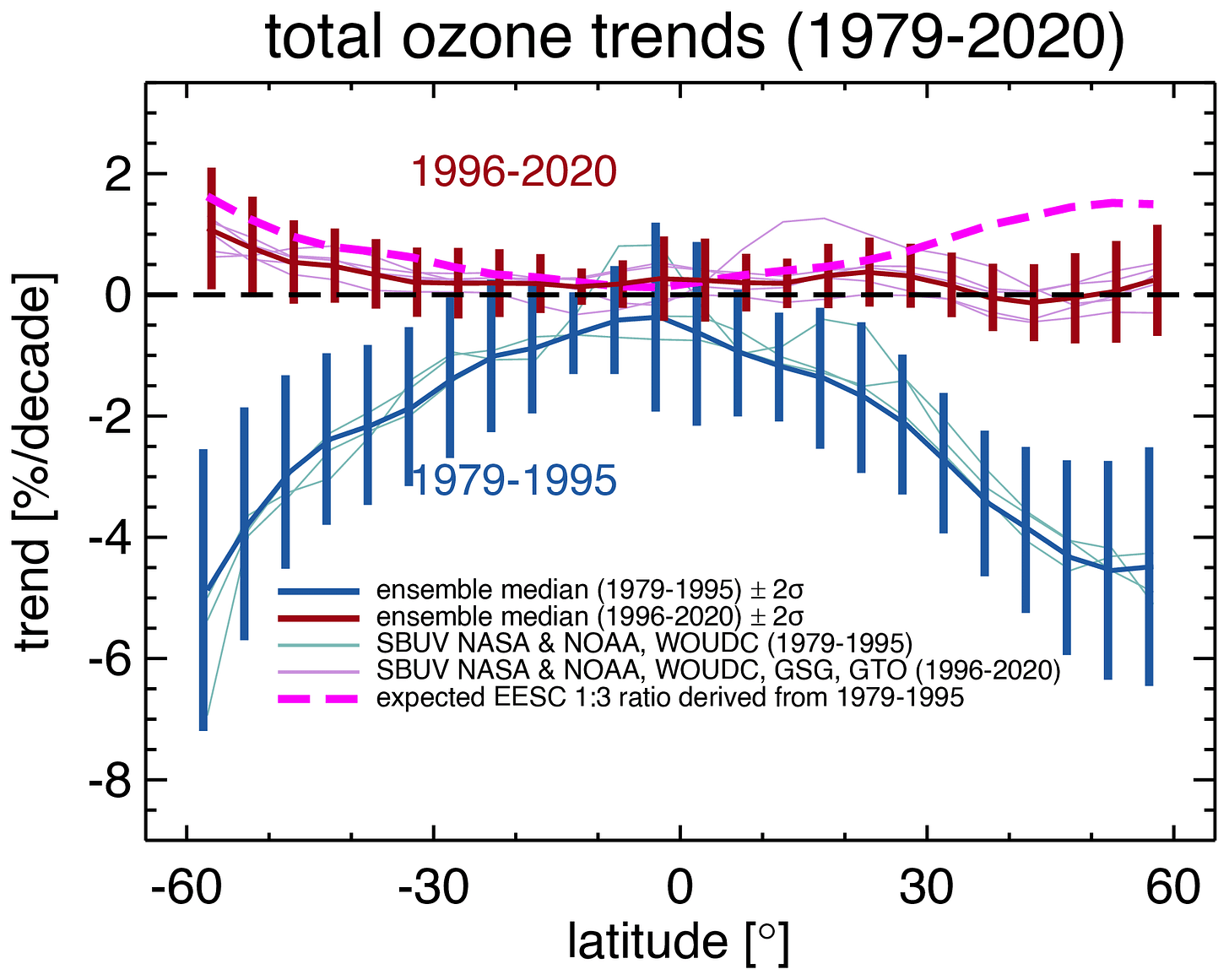
What’s more, their possibly optimistic recovery rate reported since 1996 is still slower than it should be. The plot below - from the same paper - compares trends for both periods as a function of latitude. The expected trend calculated for 1996 to 2020 is also shown (the purple line). The average of the measured trend is shown in brown. There’s reasonable agreement between the two curves in the southern hemisphere, but not in the northern hemisphere. There, it’s not recovering as fast as expected, especially at higher latitudes where there is a clear separation between the predictions (purple) and measurements (brown). At those higher northern latitudes, ozone should by now be increasing at more than 1 percent per decade, but the measurements show that its essentially flat.
The situation is clearly a lot better now than prior to the mid-1990s when ozone was decreasing rapidly - especially at higher latitudes where its rate of decreases was about 5 percent per decade.
But something isn’t quite right. It looks like there’s more work to be done to ensure ozone’s continued recovery.
Thanks for reading this. Previous posts on the intersection between Ozone, UV, Climate, and Health can be found at my UV & You area at Substack.


