
Tarnished Marble
Heartbreaking, but perhaps a blessing in disguise ...
What a relief on 8 April NZ time, when tRump’s most recent ‘deadline’ for the ‘decimation’ of Iran (proving he doesn’t know the historical meaning of the word) passed without escalation. In my humble opinion, the best off-ramp for all concerned, would be to implement the 25th amendment. Please do it soon, America. The new administration could explain that the late-night rantings of the nutter no longer apply, and could we all please start again?
But there was also a sad moment later that night for me while I was watching an episode of Steve Colbert’s Late Show on YouTube. After his usual rant about bad-news tRump, Colbert moved on to the unrelated good-news story of the night: the Artemis circumnavigation of the moon. He included an image of planet earth compared with the famous Blue Marble image taken from a similar vantage point during the Apollo mission in 1972. The comparison was a stark reminder of a rosier past. I found this version of the pair at Google Images (with apologies for that spelling of Artemis).
Note the updated figure caption.
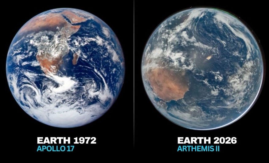
Sadly, it’s not hard to spot the difference between the new image and the one from 54 years earlier. Even Colbert alluded to it.
Everything’s got a lot murkier. Even the cloud-tops are no longer white. It all looks kind-of smudged now. At left, it’s easy to discern the continental outline of Africa, but for the life of me I can’t identify the large shrouded land mass in the recent image. It’s too dirty to see properly. Our previously pristine planet of 1972 now looks vibrant in its youth compared with the decaying image at right. We have tRump and his ilk to thank for the change. Like him, our planet seems far past its prime.
While fossil fuel companies were being enriched at the rate of nearly US$3 billion dollars per day for every day over those intervening years, the waste products were building up in the atmosphere leaving others to pay for the consequences. Surely some of that 50 trillion dollars could have been spent on their clean-up! Instead, their focus has been enriching themselves and lobbying politicians like tRump to ensure their desecration of our atmosphere can continue unabated. That, of course, is what the Iran conflict is all about. It’s the oil. As usual, the aggressor just wants to get his hands on some of it for himself.
Since 1972 the world’s population has more than doubled. Our emissions of carbon dioxide have also more than doubled, and its concentration in the atmosphere has increased by 30 percent. Concentrations of other man-made greenhouse gases have also increased: methane by nearly 30 percent and nitrous oxide by 14 percent. These aren’t small changes, and we’re already seeing their consequences.
Temperatures have increased by more than 1.1°C over those 5 decades and the resultant costs of storm damage (and our insurance premiums) have increased by a factor of ten. As I noted above, it’s hard to tell what countries underlie that brown atmosphere, but I guess the pollution is possibly worse than usual if it overlies the current spheres of tRump-sponsored conflict. That brown smudging may be from associated smoke and aerosols from fires. It could also be from another indirect product of combustion, nitrogen dioxide - which is one of the few gases that absorb at visible wavelengths. It absorbs blue light leaving a preponderance of red and yellows (brown). The brown tinge in the image at right is very reminiscent of the colour of a calibration cell of nitrogen dioxide we made in the early 1980s as part of an effort to measure its concentration in the lower atmosphere. We used those absorptions of blue light to measure some of its lowest concentrations ever seen. At times it was less than 20 parts per trillion in our pristine part of the world. I’ve no doubt that the baseline would have moved up over the intervening years. But by how much? Just a few percent? Or perhaps a factor of 2, or even more? Could that be playing a part in the browning of our planet as viewed from space? Probably not. Even though the reflected sunlight we see has traversed earth’s atmosphere twice, the sun would have to be close to the horizon to cause that much absorption. Still, it’s time we repeated those old measurements.
On the subject of the ‘war’ in Iran, although the human and economic cost is high, tRump may have inadvertently done the world a huge favour and his friends in the fossil fuel industry a disfavour by accelerating the move from fossil fuels. In New Zealand, for example, the sale of electric cars has nearly quadrupled since the beginning of the war. That will help. We’ll have to transition anyway because our supplies of fossil fuels will run out in a few decades, but any steps to accelerate the phase-out are much appreciated and much needed.
You won’t find tRump talking about the difference between those images. He would have us believe that climate change is a hoax and that he and his cronies can continue to use the atmosphere as a garbage dump without consequences. To help push that narrative, he’s doing his best to neuter agencies like NASA, NOAA and NCAR who tell the truth about our atmosphere.
But, there’s glimmer of hope. There’s already been some push-back from within his own party. The camera doesn’t lie, and with this pair of images, previous supporters may begin to see through his lies. Richard Nixon was the president in December 1972 when the image was captured from Apollo, and just 20 months after that moment of triumph he was gone. Can we hope for the same with the even more corrupt incumbent? Fingers crossed.
We’re still holding our breaths on the ‘war’ front where tRump has painted himself into a corner. Some light relief on the subject was provided by local cartoonist Shaun Yeo, whose work is worth a look. His offering below appeared in our local newspaper on 20 March. Nothing’s changed since then.

Great article! I completely agree with the sentiment regarding pollution and degradation of earth. I wondered though if the differences in the images could be attributed to other factors and so I asked another one of my knowledgeable friends (chatGPT). It seems there are a lot of differences in how the images were created, not least of which that the recent image was taken at night!
Wikipedia has entries on these images too.
https://en.wikipedia.org/wiki/Hello,_World_(photograph)
It would be interesting to see more academic discussions on whether the apparent pollution affects seen are real.
It seems NASA may have missed a golden opportunity to more closely match the lighting and equipment used.
Cheers
The images of the earth side by side are sobering. You have made some heartbreaking analysis 😢😢