After my post about carbon cycling, my mate Stan suggested including a graph to show the direct relationship between CO2 and temperature. It’s nicely illustrated, along with projections for the future, in this 1-minute clip on You Tube.
Thinking about past and possible future ‘utopias’ with those much warmer temperatures, this nice 10-minute clip on You Tube, is worth a look.
It’s a bit dated now, as reflected by the now ridiculously low figure of 0.7C that they quote for man-induced warming back then (early this century). By 2020 it was 1.1C, and it’s now 1.2C and increasing rapidly.
The clip has some scary things to say about the current rate of change too.
What it doesn’t say about a return to these warmer conditions sometime in the future, is that most of us will need to find somewhere else to live. Without the polar ice caps, the sea level will be about 70 metres higher. All of New Zealand’s biggest cities (Auckland, Tauranga, Hamilton, Wellington, Christchurch, Dunedin), accounting for more than half of the country’s present population, will be far below sea level. Most of the remaining centres (including Whangarei, Napier/Hastings, New Plymouth, Whanganui, The Hutt, Nelson, Timaru, and Invercargill, ….), and the fertile plains around them will also be submerged. Together those regions account for more than 75 percent of New Zealand’s current population. The capital city would have to be moved from Wellington to somewhere like be Rotorua, Taupo, or Queenstown.
It’s of course worse for maritime countries like New Zealand. Especially for low-lying Pacific-Island countries like Tuvalu, which will cease to exit. And bad too for all low-lying countries. In Bangladesh, for example, the 8th most populace country in the world, the vast majority live less than 50 metres above sea level. The world will have 150 million displaced people to deal with from that country alone.
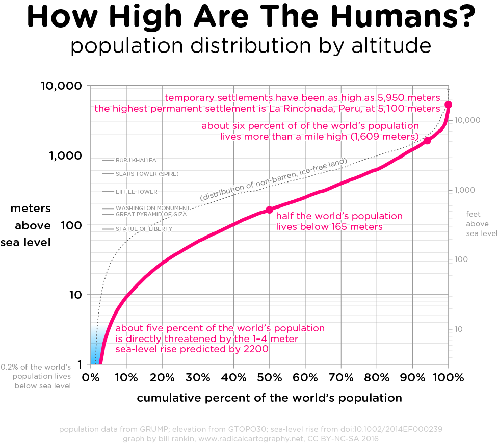
Its not quite so bad for the world as a whole, but ‘watered-down’ version of the problem (if you’ll excuse the pun ) applies to most countries of the world. The graph below shows that about one third of the world’s population lives at altitudes lower than 70 metres. In a global population of 9 billion that would mean something like 3 billion people would need to find somewhere else to live if the ice caps were to melt completely.
The dotted line on chart also shows that for that increase in sea-level, the per-capita availability in arable land would be about half that at present. A recipe for global conflict.
But we’re talking here of hundreds of years into the future or longer (hopefully). At least it won’t be my problem. A classic SEP.


