


There were only a few subscribers to UV & You when I first posted an earlier version of this ‘way back when’. I tried re-posting this update yesterday, but it didn't go out to the full email list. Just to the subset using the Substack app. So here we go again. Sorry for any duplication.
The Book
During New Zealand’s first COVID lock-down I filled my time writing a book that described my personal journey through a life in atmospheric research: especially looking into ozone and UV radiation and its health effects. The book’s titled ‘Saving our Skins’. It was first published in 2020 and is still available through Amazon - in three versions including kindle. It’s stood the test of time remarkably well. But I’m not going to get rich from their sales, so I’ve made an an updated version freely available to you here at Substack: Saving our Skins: Table of Contents.
And, now that this post is pinned to the top, you can always find your way back there (if you’re using the Substack App).
My semi-regular posts here at UV & You over the last few years grew from that book-writing experience. It’s been a lot of fun. Thank you for sharing this part of my journey. May it long continue … 😊
A version of this introductory post below first appeared in 2019. An updated version has just been pinned to the top of UV & You.
The Banner
In the first iteration of UV & You, the banner that went out at the head of emails was this beautiful 180-degree panorama.
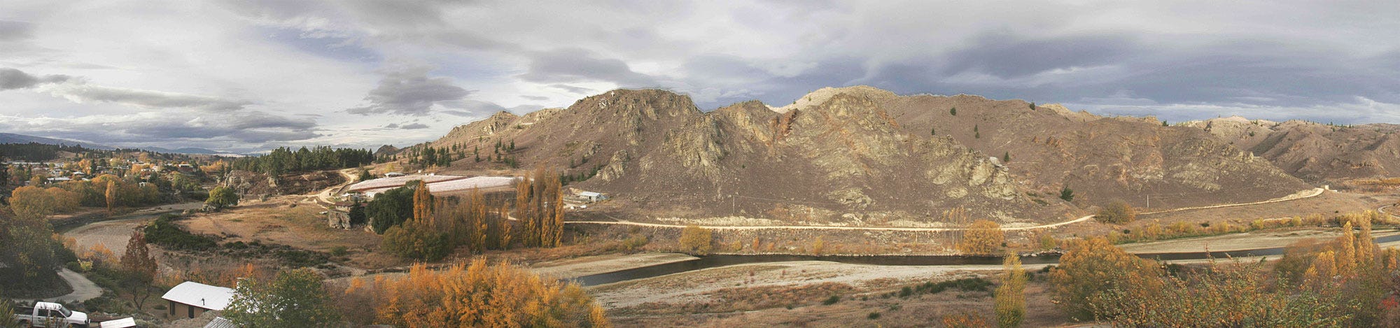
It was taken by my brother Greg, and captures the stark Central Otago landscape I’ve come to love. Locals will be able to tell (from the just-discernible white cross above the clock-on-the-hill at centre left) that it was taken at Easter. The wider vista is the Manuherikea River and the hills of the Matangi sheepstation behind, as viewed from our home in Alexandra. Greg’s a very accomplished photographer, as you can see if you look here or on his Facebook pages. I’d been using his panorama without permission. He never complained, but I’m sure that you’ll agree that - although it’s a nice photo- it’s not particularly relevant to the topic.
So, in October 2019 I switched to a stylised version of the image below, which compares the solar spectrum outside the Earth’s atmosphere (blue curve) to a reference solar spectrum at the Earth’s surface (black line).

The reference spectrum is one adopted by the photovoltaic industry to represent the average midday spectrum of sunlight received on a plane (e.g., a solar panel) tilted towards the equator at mid latitudes. The main sub-divisions of the spectrum are also marked. I must thank my colleague, Ben Liley, who wrote the computer code to overlay the colours for the visible part of the solar spectrum. The total solar energy arriving for these conditions, represented by the area under the black curve, is about 1000 Watts per square meter.
Some further explanation of the figure is probably helpful.
You might notice that the wavelength axis is distorted, with shorter wavelengths squashed up to emphasise the UV part of the spectrum. I’ve done this using the mathematical trick of plotting the wavelength on a log scale. Of course, the transitions between visible and non-visible (shown in black) will not be as sudden as shown and may even vary from person to person. But hopefully you’ll get the idea.
The sharp dips in the Visible and UV, that occur in both lines, are caused by gases in the Sun’s atmosphere. They’re called Fraunhofer absorption lines, named after their German discoverer.
The UV region is labelled in RED, as it’s the main focus of these posts. It’s arbitrarily divided into two sub-regions:
UV-A. Wavelengths from 315 to 400 nm,
UV-B. Wavelengths from 280 to 315 nm.
It’s the UV-B component of sunlight that’s most harmful to life on Earth, but ozone protects us from most of it. The rapid decrease in intensity in the black curve towards the shortest wavelengths is due to increasing absorption by ozone in the Earth’s atmosphere.
The broader absorption features at longer wavelengths in the black line (but not the blue line) are due to water vapour and other “greenhouse” gases in Earth’s atmosphere. Absorptions by carbon dioxide are largest at longer infrared wavelengths especially near to 10 microns, at the same wavelengths that Earth re-radiates energy back to space.
That’s the nub of the global warming issue. While greenhouse gases like carbon dioxide have little effect on the incoming solar energy, they block the outgoing energy. The resulting energy imbalance leads to warming at the surface. But that’s another story ...
That’s enough of the tutorial, but if there’s anything you don’t understand, feel to use the feedback button to ask.
Now, back to the burning banner question.
I’m sure you’ll agree the new banner figure is more appropriate. Though, now that I’ve explained it, I’ve simplified it to a stylised version without numbers.
Here it is ….

And here it is again, this time with linear axes and more normal aspect ratio and more detail on the breakdown between UVB and UVA.

Finally, when plotting just the UV part of the spectra, scientists like me usually use a logarithmic scale for the y-axis, as below. The plot uses exactly the same data as in the one above, except that it’s limited to UV wavelengths between 280 and 400 nm.

Now you can clearly see the dramatic effect of absorption by ozone in the atmosphere, especially for wavelengths less than 315 nm. Each tick on the y-axis corresponds to a factor of ten change, so at Earth’s surface, the irradiance at wavelengths less than 300 nm is a tiny fraction of that arriving from the sun outside the atmosphere. For example, at the shortest wavelength shown (~297 nm), the irradiance at Earth’s surface is reduced by a factor of 50,000 compared with that arriving above the ozone layer.
The shorter the wavelength, the more energy each photon packs, so the more damaging it can be. That’s why we use the log plot, to emphasise what’s going on at those shortest wavelengths.
Add your email address below to subscribe for free occasional new posts.