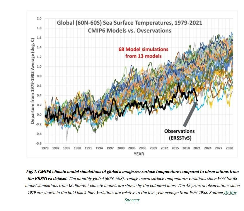
A skeptic’s view, which purports to show that observed temperature changes are much smaller than calculated with models, recently appeared in my in-box. The author uses the plot in an attempt to discredit the atmospheric science community. I don’t know how the article got through the review process. That’s if there is one for that publication. You don’t have to look hard to find misinformation on a myriad of subjects from that source.
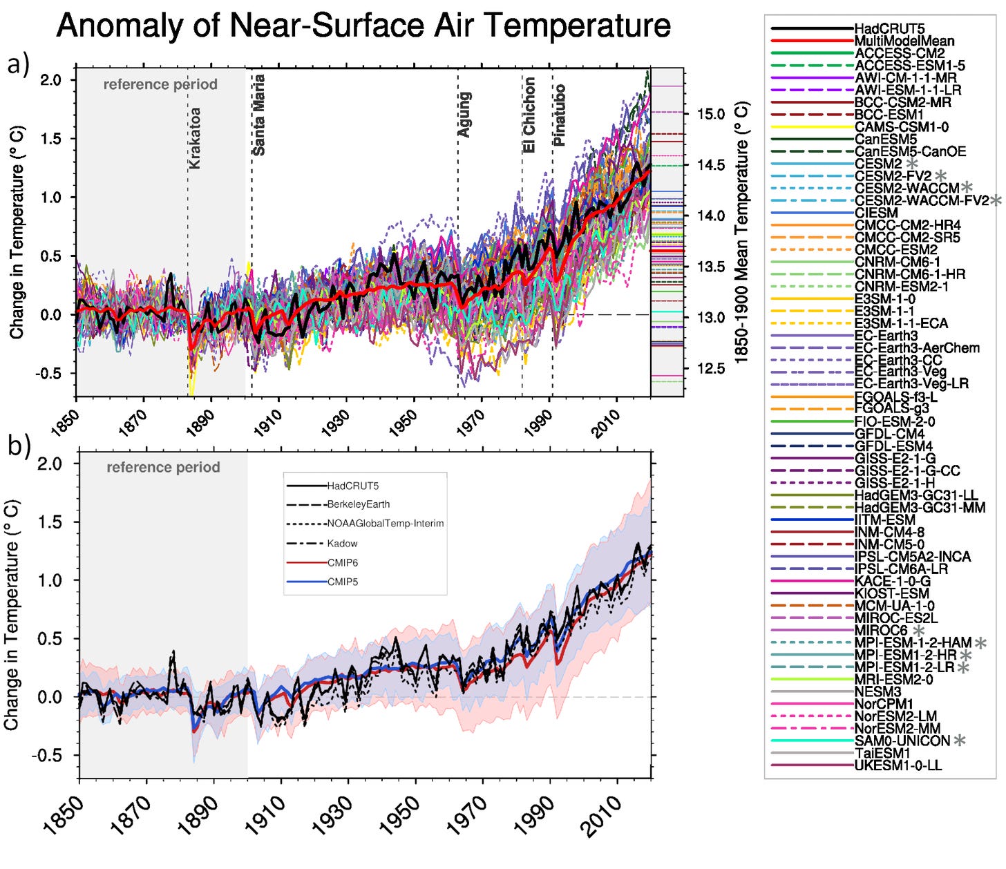
What’s wrong with the plot? Well, quite a bit as it turns out. The authoritative IPCC’s view (Figure 3.4 from their 2021 AR6 Report) is reproduced in the upper panel below.
Their message is very different. It shows that measurements and models are in agreement. The IPCC freely admit that there are limitations to their models, and the agreement isn’t perfect. In the executive summary of Chapter three of their most recent report, they say “.. some CMIP6 models simulate a warming that is outside the assessed 5–95% range of observed warming”. But as you can see from the above, most are in reasonable agreement. While some model runs are too high, and some are too low, their mean (the heavy red line in the upper panel) is a close match to observations (the heavy black line).
So, why is that take-home message so different?
The IPCC figure shows changes from 1850, while the skeptic chooses to start the comparison at 1979, a high point in the observations, to minimise any increase.
The IPCC’s observed temperature increases (black line) are from a variety of sources, both land-based and oceanic to truly represent the model values, while the skeptic chooses to compare with only one data set - one that shows the much smaller temperature changes over oceans.
The IPCC shows results from over 60 modelling groups, while the skeptic choose to compare with only 13 - presumably those with the largest changes to emphasise “differences” between measurement and model.
Even with the skeptic view, we still clearly have a problem. The IPPC data shows that global temperatures have increased by about 1.3°C since the industrial revolution, and by about 0.8°C since 1979. The skeptics data shows that temperatures over oceans have increased by around 0.4°C, which is in reasonable agreement with the IPCC values (discounting the suspicious decrease seen in the last few years of the skeptic’s data).
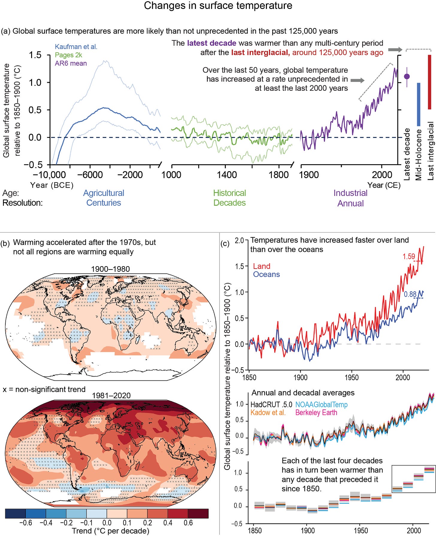
According the IPCC, increases in ocean temperatures are about half those over land, as shown in panel (c, below) of the IPCC’s Figure 2-11. Note that the skeptic’s dip in recent years is not present, showing that there may be unresolved issues with recent data from the ERSSTv5 data he selected. Panel (a) of the same figure also very usefully puts recent changes into a longer term context, and Panel (b) shows the accelerating rate of increase, and the geographic variability (including land sea differences, which have been large since 1979). In fact, some parts of the ocean cooled slightly over that period - possibly due to induced changes in circulation patterns.
It’s pretty obvious to me which is the truth. If you want the real oil about Climate issues and our current understanding of them, the IPCC is a good starting point.
Thanks for reading this. Previous posts on the intersection between Ozone, UV, Climate, and Health can be found at my UV & You area at Substack. Click below to subscribe for occasional free update


