Let me start by apologising profusely for the glaring typos in my post on Tuesday April 21st. My (honorary) proof-reader (who doubles as my wife Louise) was celebrating a significant birthday that day and didn’t get around to completing that task. There were far better things to be done.
In my last two posts I talked about the possibility of Covid-19 inactivation by UV, and concluded that when the UVI is around 10 (as in summer at noon)), significant inactivation to the virus may occur in less than an hour. But when the UVI is less than 5 (i.e., Outside the summer period), there’s little damage to the virus. There are other risks and benefits too, like sunburn ad vitamin-D production. For all of these, the outdoor exposure you need to optimize health outcomes depends on the UVI.
But how do you find what the UVI is at any time or place? Our bodies don’t have any sensors to measure the UV. Any resulting sunburn arrives too late to be useful. There is a correlation between UV and the brightness of sunlight, but the correlation isn’t as strong as you might guess (depending differently on sun angle, ozone amount, and cloud effects). It’s not strongly correlated with temperature either. As I mentioned last time, you can get information about the current UVI from smartphone apps like UVNZ, uv2Day and GlobalUV (those first two have better cloud forecasts, but are restricted to the New Zealand region). But the overall picture for different seasons is harder to come by. If you happen to have the android version of GlobalUV you can get results for other seasons by rotating the phone and selecting the month of interest (a secret not many know about). But a plot that my colleague Greg Bodeker made many years ago summarises the picture very nicely indeed for New Zealand.
The colour version shown below is from a paper we wrote way back in 1996. It compares the calculated daily and seasonal variations in sun-burning UV at two New Zealand sites: one in the north (Leigh), and the other in the south (Lauder). He called it a Madonna plot. Coming from an earlier generation, I would perhaps have called it a Sabrina plot. But of course no such frivolities are allowed nowadays. I forgot to include it in Saving our Skins, but I’m redressing that here.

The take-home New Zealand-focussed messages are:
1. The UVI is strongly peaked near the midday period
2. There’s a huge seasonal variation in UVI, with winter values being only 10% of summer values in the south
3. The UVI is higher in the north, especially in winter when it’s twice that in the south.
The corresponding plot for northern mid-latitudes isn’t nearly as alluring (unless seasons are offset by 6 months). The summer peak would be lower because of the higher ozone amounts, and the greater Earth-Sun separation at that time of year, and the winter minima wouldn’t be as low because of the closer Earth-Sun separation then. Normally, pollution would pull both seasons down as well, but perhaps not at the present time with transport and industry curtailed by lockdowns against the Corona virus.
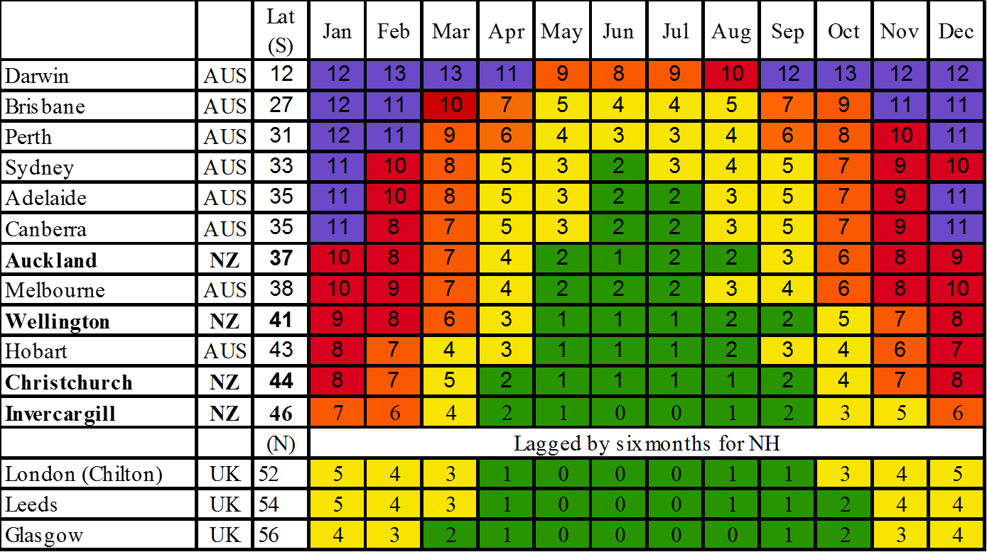
Those Madonna plots are very pretty and evocative, but they really just give the overall impression. More quantitatively, the table below - which you may recall seeing in Chapter 18 of Saving our Skins - compares the mean monthly UVI measured at noon for several New Zealand sites with sites in Australia and the UK.

Because of cloud absorptions, these measured values are typically about 70% of clear sky values, so to estimate the peak UVI, divide by 0.7. For example, in Auckland, the mean noon UVI in January is 10, so the peak clear-sky values is about 10/0.7 = 14. That’s in reasonable agreement with the peak value calculated for Leigh, which is just north of Auckland.
The table clearly shows the progression to high UV closer to the equator. As a result, New Zealand gets less UV than Australia, especially in winter. But our UV in New Zealand is twice that in the UK. The highest clear-sky UVI anywhere in the world is about 25 (near Cusco Peru), nearly twice that seen in New Zealand.
Sign up for more ….


