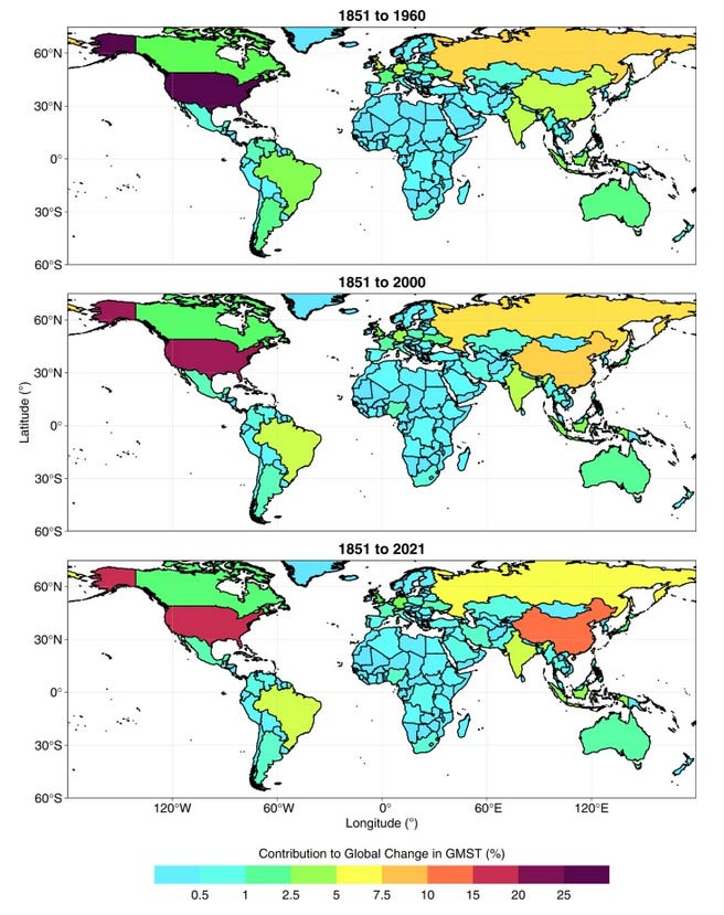
My colleague Germar Bernhard pointed me to this interesting paper that just appeared in Nature. A key figure from it shown below. It shows how to apportion blame for the warming that occurred, over three time periods. The first is the one hundred-and-ten year period from 1850 to 1960. The second extends that by 40 years (to year 2000) and the third extends it by another 20 years to near the present (year 2020).

Ad you can see, the comfortable winner in each case is USA, but the gap between USA and China is narrowing quickly. The USA is responsible for 15 to 20 percent of the problem. Despite having four times as many people, China is responsible for only 0.7 of the USA. And India with a similar population contributes less than 0.4 of the USA.
As some ostriches keep reminding me, the contribution of New Zealand the problem is small (so its not worth us doing anything).
But, on a per capita basis we’re no angels. Although we represent only 0.06 percent of the world’s population, the map shows that we are responsible for about 0.5 percent of the problem. We’re about a factor of eight worse than the average global citizen. On a per capita basis we’re nearly twice as bad as the average American citizen. We’re also about ten times worse that the average Chinese citizen and twenty times worse than the average Indian citizen.
Each and every global citizen needs to play his part in the solution. If we’re not part of the solution, we’re part of the problem. But, is it fair to require Indians and Chinese to do more than us to fix the problem just because they happen to live in a populace country? Of course not! We should be leading the way.
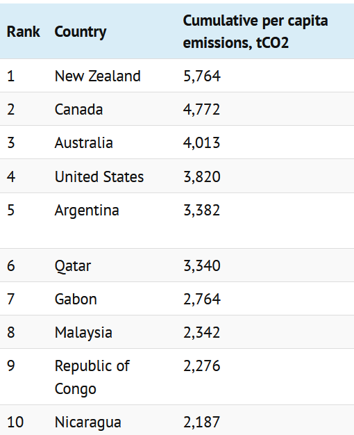
Germar pointed me to another website that shows that by some measures we in New Zealand win the booby prize at the world’s worst polluter.
The top ten are shown below. It’s not often we beat USA, Australia and Canada. We managed it comfortably this time, but it’s no reason for pride.
By this measure we’re worse than USA by a factor of 1.5. China doesn’t even make the top 20 in that list, so we’re worse than them by at least a factor of 3 (and probably much more). The numbers are different from the map above because they’re based on the population at the time the emissions occurred, rather than all being index to the present-day population. The website also says
New Zealand ranks at the top of this list because of extensive deforestation during the 19th century, when much of its native Kauri forest was cleared for its valuable timber. The country’s tiny population at the time consequently had very high annual per-capita emissions, with the cumulative total by 1900 making up around two-thirds of the total amassed by the present day.
Which I guess is another way of saying that Kiwi workers back then were very efficient at their job!
But its the present lot that I’m more concerned about.


Not Us ! Not Me ! Rhubarb !! Of course it's us, us, us Westerners with our greed and overconsumption of Global Resources. Particularly the British Empire grabbing the land of 1,2,3 plus much of 4. Method used - Death and destruction. Results to date - Same old same old.
But hey, its so easy to blame others, thereby ensuring the continuation + ever more of the same !!!
The only way to change our uncertain future is to change ourselves, only then will we actually have a future. Shout it out "Mea Culpa"
Peace, Maurice.
Sadly, this is no surprise. There's another graphic that's worth a look here. Most wealthy nations have been reducing emissions since 1990. NZ was like "Climate change? What's that?"
https://www.bbc.com/news/science-environment-65754296