A few weeks ago, I wrote a couple of posts (here and here) implying that you don’t need to worry too much about UV transmission from glass.
So I was a bit surprised when I saw this interesting preprint. It’s just the sort of study I’d been looking for when I wrote those posts above. I would never have seen it, except that they happened to cite a paper I’d co-authored, so I got a notification from google about it.
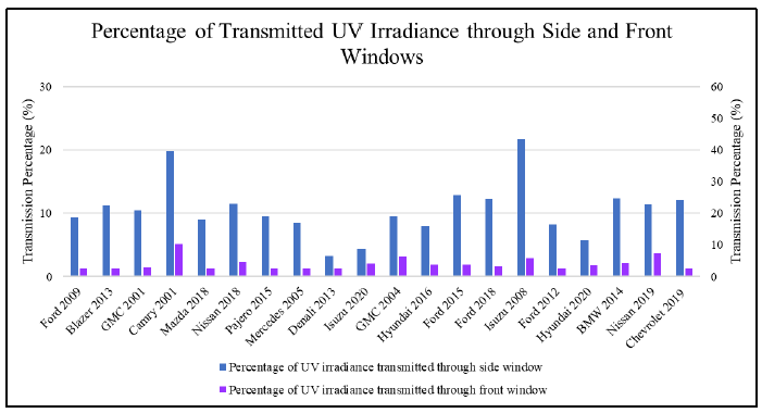
The new paper reports the measured the UV and IR transmission through the windows of about 20 cars. They found the average transmission of ultraviolet radiation through the (non-laminated) side-windows was about 10 percent, while through the (laminated) front windscreens it was only 4 percent. Those numbers are bit higher than I’d expected. The IR transmissions were higher again: about 30 percent through sides and about 40 percent through the front. But that’s another story.
There was a lot of variability in UV transmission between vehicles, as shown in their figure below. I’m not sure why they show two y-axes. Neither scale seems to quite match with their 10 and 4 percent averages. It’s not the only confusing thing in the paper 😊 (which doesn’t seem to have yet gone through a rigorous peer-review).
And what do the authors mean here by UV? Is it the total UV at all wavelengths below 400 nm, or just the more damaging UVB component (at wavelengths less than 315 nm). Or do they mean the skin-damaging (erythemally weighted) radiation, a scaled version of which is provided to the public as the UV Index (UVI)? They say the instrument used to measure it was a PMA2100 from Solar Light, but that comes with various sensor options, including both UVB and UVA wavelength ranges.
Luckily, we can back out the wavelength range used by looking at their numbers and comparing them with the range of values that reach Earth’s surface. The peak UV irradiance they measure is about 60 W/m2. That tells me that the quantity they’re measuring is mainly the less harmful UVA component (which is close to the total UV radiation), rather than the more harmful UVB component. UVA radiation can reach values around 70 W/m2, whereas the maximum for UVB radiation - which is highly absorbed by ozone - is never more than about 3 W/m2 anywhere on Earth’s surface. And erythemally weighted UV is only about 1 seventh of that. Its peak value is about 0.5 W/m2, which corresponds to a UV Index (UVI) of 20.
Unfortunately - to add to the confusion - the title of one of their figures incorrectly labels the measurements as being UVI (UV Index), rather than UV irradiance.
It’s a pity the authors hadn’t used a sensor that was sensitive just to that skin-damaging UV. It would have made it a far more useful study. But for all glasses, especially those used in laminated windscreens, the transmission is dramatically less at UVB wavelengths than at UVA wavelengths. With that extra knowledge, the UVB transmission (or the UVI transmission) would reduce to less than 1 or 2 percent. That’s equivalent to a sunscreen of SPF50 or better, and therefore confirms that the risk of UV damage from sunlight is small inside your vehicle (provided your windows are rolled up).
But make sure you keep those windows rolled up. The well-used image below (copied from here) reminds us of the importance of that for skin-protection against UV damage. It shows the skin-damaged face of a 69-year-old man who’d driven a delivery-truck for 28 years. No prizes for guessing which side of the road he drove on.


Yes, the axes on that plot are a bit strange. The purple bars look to be associated with the right axis and the blue bars the left axis, but this choice just exaggerates the difference - what did the caption text say in the paper. They should just have used the single left axis.