UV down under compared with the UK
More on why skin cancer rates in New Zealand and Australia are so much higher ....
This is a ‘Work-in-Progress’, but I wanted to get something out to add to a talk I’m giving at a Skin Cancer Conference in Brisbane this week (in case I had to hurry through it too much 😊). In any case, I think you’ll find it interesting despite its limitations.
A few weeks back, I showed plots comparing the latitudinal variation of UV between the northern and southern hemispheres. The results were based on calculations that included the effects of ozone, solar elevation angle, and Sun-Earth separation. At the time I said that they need to be taken with a grain of salt because the effects of clouds and aerosols were omitted. It turns out that they are indeed quite important.
The plot below is a follow-up.
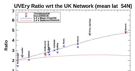
The labelled symbols show the ratio of mean annual doses of sunburning UV at sites in New Zealand and Australia (down under) compared with those in the UK. The UK data are from a network of sites with mean latitude of 54°N (near Manchester). The down under ratios range from less than 2 at the highest latitude site (Invercargill) to nearly 5 at the lowest (Darwin). In the most densely populated areas of both countries, these annual UV doses are quite similar and are about three times as high as in the UK.
The dotted black line is a scaled version of the corresponding calculated ratios from my earlier posting. To get agreement with the measurements, I’ve had to scale the ratios up by a factor of 1.4 to account for the smaller attenuation by aerosols and clouds at the Down-under sites. The lack of cloud and pollution down under compared with the UK clearly has a large effect (sorry, couldn’t resist that pun ). Alone, it’s responsible for the down under UV doses being 40 percent greater.
The dotted red line in the plot is the calculated ratio for the month with the highest summer UV dose down under (December) relative to that in the UK summer (June). These summer ratios show a much smaller latitudinal gradient than ratios for the annual doses. The summer doses down under are about a factor of two greater than in the UK.
What I haven’t yet done – and maybe never will - is compare this calculated ratio with measurements because I don’t yet have access to the monthly mean data. In the meantime, I’ve just assumed that the same scaling factor for clouds and aerosols (that factor of 1.4) applies for all seasons.
If the summer data do line up as with the red line as expected, it will be no wonder that the skin cancer rates down under are a factor of two greater than in the UK. The smaller latitudinal slope would also help explain why rates in New Zealand are similar to those in Australia, despite its much larger annual UV dose. Other possible explanations include different ethnic mixes, and different outdoor behaviour patterns. For example, with its cooler climate Kiwis may tend to seek the sun, whereas with their hotter climate Aussies may tend to seek shade.


